There are many templates out there for creating responsive percent-based columns. Percentages like 10% or 50% or 25% work because they add up to 100% so they will align.
When you need columns split into thirds, for example, they will not line up perfectly by using 33% for width.
Let’s say you have your three columns 31% wide with 1% left and right margins. This only totals 99% of the space. If you have other “rows” using 50% or 25% and they equal 100%, this means your 99% columns will not align correctly.
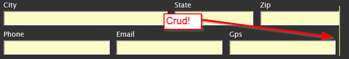
In this image you see a simple form. In the above row, there are two fields at 50% each. Under it are 3 columns that total 99%. You can see the slight alignment problem.
The fix basically involves finding a way to make just one of the columns 1% wider. I’m sure this can be accomplished in many different ways. Perhaps a single “fix” class applied to one of the columns? I found a simple way to add 1% to the width of the third element on the page with the css “nth-child-of-type” selector.
._33:nth-last-of-type(3n+3) {
width:32%;
}
The W3C says this is supported in all major browsers except IE8 and older. W3C Info.
Essentially it finds every 3rd appearance of the “_33” class and adds the 1%. This makes it automated as you don’t have to worry about adding an extra class as a fix.
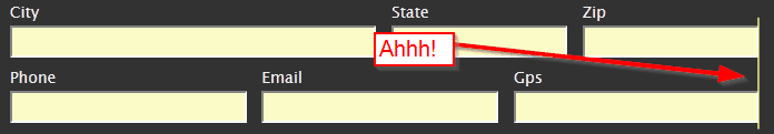
Here you see the same image with the above CSS applied:
This only works if you “always” use your 33% columns three times. Naturally if you had a 2/3rds column and a 1/3 column it would break. In that case, you can adapt this fix to your needs, use “fix” classes, or have a different class for a 1/3rd column when used with a 2/3rd column etc.
I hope you find this little trick useful as you create your responsive design!